Some logos are very creative and have subtle symbols and messages that represents something about the company it stands for, they can convey many ideas in one simple design and as designers we need to be fully aware of any hidden symbolism.
In this post we've compiled some great logos that carry hidden symbolism that you can use for inspiration in your own designs.
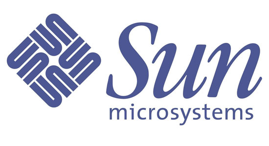
Sun Microsystems

If you look at the diamond icon on the left of the company’s name, you will see that it spells out Sun starting from any corner. It is a wonderful example of symmetry.
Amazon.com

This logo has been around for over a decade, but many people do not know that there’s a hidden symbolism in Amazon’s logo. The arrow from A to Z represents that the website sells everything from A to Z, and doubles as a "smile" to suggest satisfied customers.
Baskin Robbins

At first glance, this logo looks simply like the initials for Baskin Robins but if you take a second look, you will see the number 31 in the acronym (highlighted in a pink color). This stems from the idea that Baskin Robbins sells 31 types of ice cream, one for each day of the month.
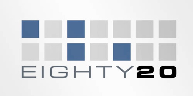
Eighty 20

This logo was complicated to figure out; the blue squares represent 1’s and the gray squares represent 0’s. This makes a 1010000 sequence on the top line, represent eighty in binary, and the bottom line reads 0010100, which represents 20 in binary.
FedEx

At first glance it’s hard to find the symbolism in this logo, but if you look closer you’ll notice the right-pointing arrow in between the ‘E’ and the ‘x’, representing precision and speed at which FedEx works.
Yoga Australia

If you look closely, you can see that this woman is making a pose that forms the Australian continent.
Northwest Airlines

The old Northwest Airlines logo has a very clever icon. Not only does the icon on the left of the text spell out N and W, but the arrow and circle symbolizes a compass pointing in the northwestern direction.
Atlanta Falcons

This logo doubles as an actual Falcon, and an ‘F’ for Falcons.
Chick-Fil-A

The Chick-Fil-A logo incorporates an illustration of a chicken with the ‘C’ in ‘Chick-Fil-A’ in a not so hidden way.
City Direct

This one is really hard to see, but if you focus on the black part of the logo, the airplane is surrounded by the initials CD for City Direct.
Families/Marriage

In the Families logo, the ‘i’, ‘l’, and second ‘i’ are all different sizes, representing the father as the long ‘l’ and the mother as the longest ‘i’ followed by the child. The upper case “R”s in the Marriage logo mirror each other with their ends sticking together, representing the bond of a relationship.
Forkwire

This online food delivery logo includes a combination of the internet key @ with a fork, representing food as well as the first half of the name – fork, making the utilization of technology in food delivery very clear and obvious for the customers.
Fort Worth Zoo

The red ‘fw’ for Fort Worth also creates an elephant.
Goodwill

Goodwill is a nonprofit organization that helps disadvantaged people in North America. The letter G in the logo is a smiling face, conveying the notion that Goodwill provides happiness and relief to those in need.
Gotham Books

This one is pretty self-explanatory. The illustrations of a book are stacked on top of each other to simulate a skyscraper – a trademark of Gotham City.
Hartford Whalers

This cleverly designed logo incorporates the tail of a whale, and the Hartford Whalers initials ‘H’ and ‘W’.
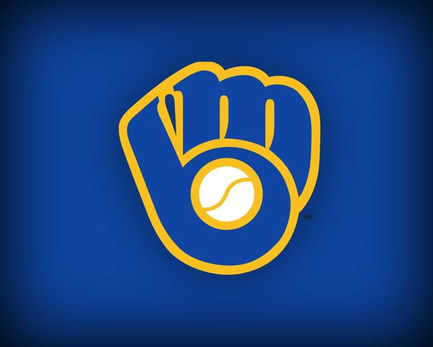
Milwaukee Brewers

The old Milwaukee Brewers logo uses the team’s initials (B and M) to form a catcher’s glove holding a ball.
NBC

The NBC logo employs a hidden peacock looking to the right representing the company’s motto to look forward, and not back.
Pakuy

The Pakuy logo consists of a simple ‘P’ made of an unfolded box, thus representing the work of the brand which is packaging.
Piano Forest

This logo has the elegant design of piano keys that look like trees to resemble a keyboard.
Schizophrenic

This logo shows the ambiguous emotions of a schizophrenic.
Toblerone

In the company’s logo, you will see a bear hidden in the mountain. The bear is the symbol of the city of Berne in Switzerland where Toblerone is produced.
Unilever

Each icon within the logo represents an aspect of its business. For example, the shirt (below the heart) symbolizes “clothes” and represent fresh laundry and looking good.
WSU

In this logo, WSU’s initials form a cougar’s head.
Hope for African Children Initiative

At first glance, this logo looks like a map of Africa, but if you take a closer look, you will see two people facing each other.
Big 10

The Big Ten Conference is the United States’ oldest Division 1 college athletic conference. Since Penn State joined in 1990, there have been 11 schools in the Big Ten. They revamped their logo by placing a hidden number 11 on either sides of the letter T to stand for the actual number of schools in the division.
If you like this post then mention in comments and share it around the world.